The Working Girl
branding + digital collateral
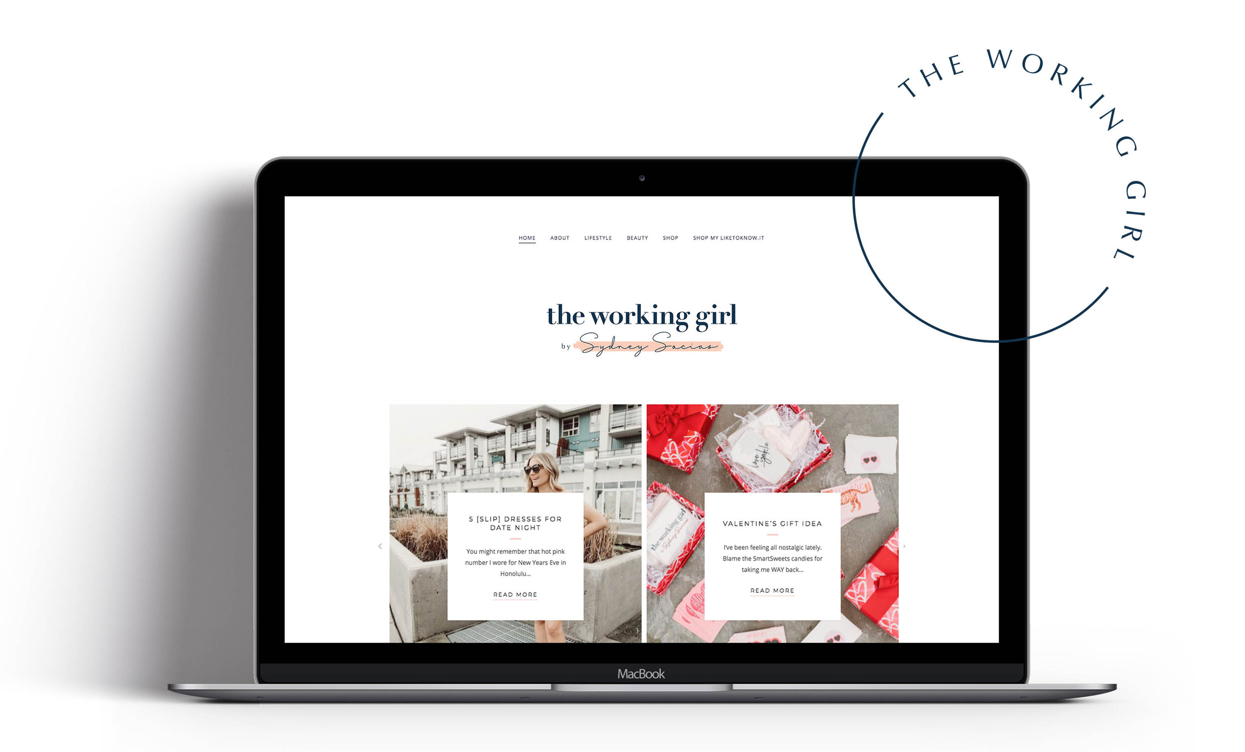
The Working Girl: Sydney Socias, is a blogger and influencer sharing personal experiences, style + beauty tips, product recommendations, food/health/recipes, and home decor trends; all focusing on a realistic and attainable approach.
A re-brand was developed for The Working Girl including the primary logo, word-mark, symbol, colour palette, and fonts. Femininity is the essence of the brand, with a young, trendy, natural style. A bold serif font is used on the blog title accompanied with a hand done script font to contrast on Sydney’s name. A brush stroke is placed in the background to emphasize the natural + youthful nature of the brand. The colour palette compliments photography on the blog and social accounts. Icons were also developed to further brand TheWorkingGirl.ca social media and highlight the blog’s primary focus points.