Effingham Oyster
branding + marketing collateral + illustration
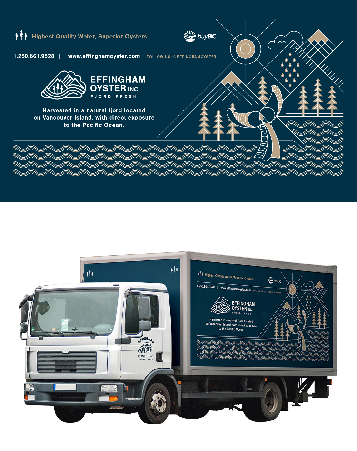
Effingham Oyster is an oyster farm on the West Coast of Vancouver Island, located in a remote deepwater fjord inland from Barkley Sound, BC.
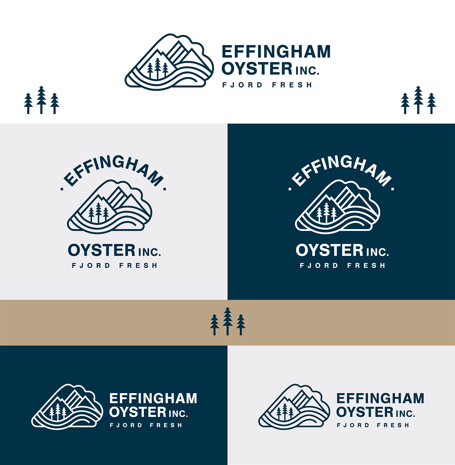
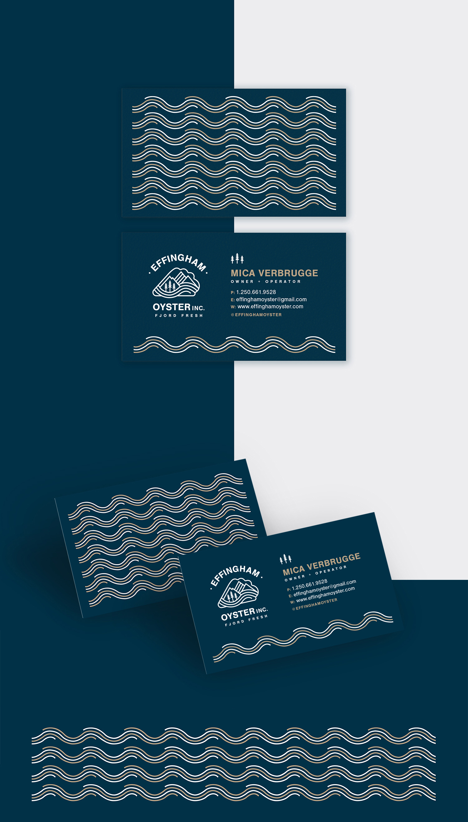
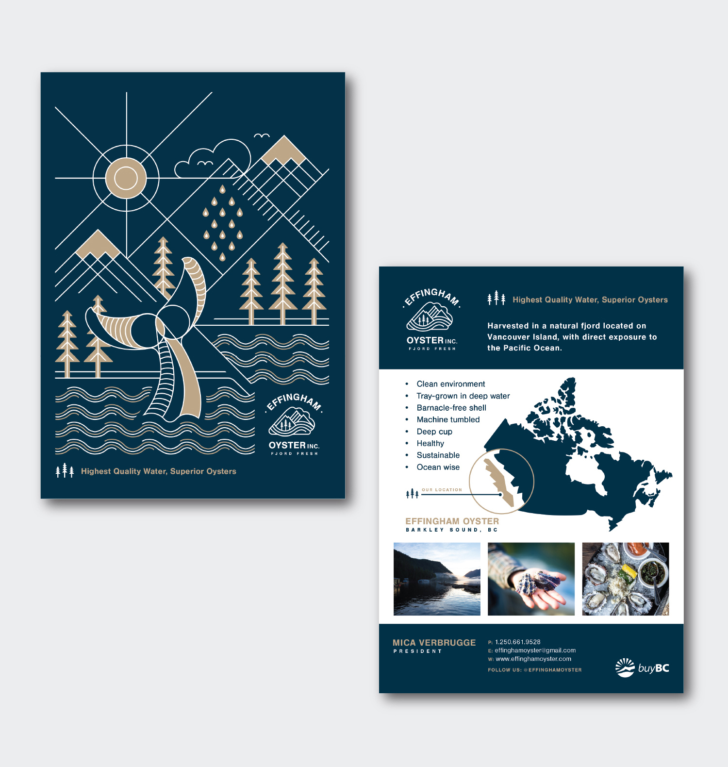
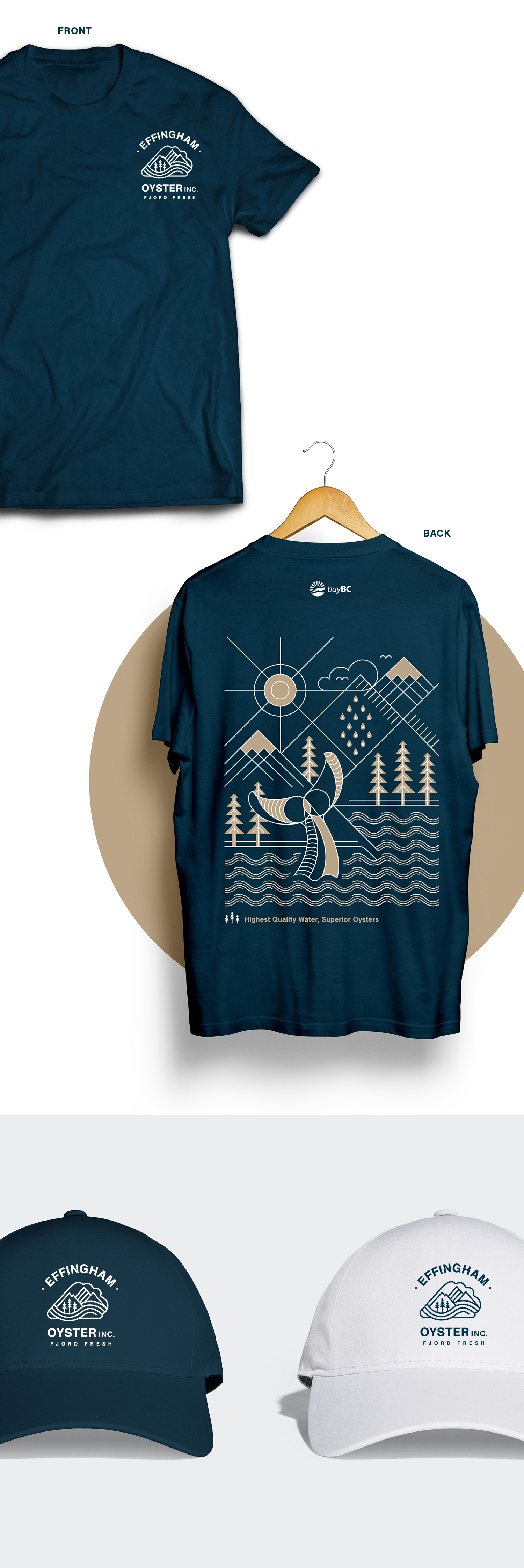
In need of a brand refresh, Effingham Oyster was looking for a logo that would represent who they are and where they’re from: a young company operating in a pristine natural environment. The refreshed logo consists of the natural elements that surround the farm; mountains, evergreen trees, glacial fjord, and the ocean, placed inside a symbolic oyster shape. The design is built out in a monoline style from which additional elements were developed across all branded items. Marketing materials were designed to support their branding and promotional efforts, including a business card, postcard, signage, product label, and a vehicle wrap. An illustration was also created playing off of the elements from the logo and applied to the various marketing items.